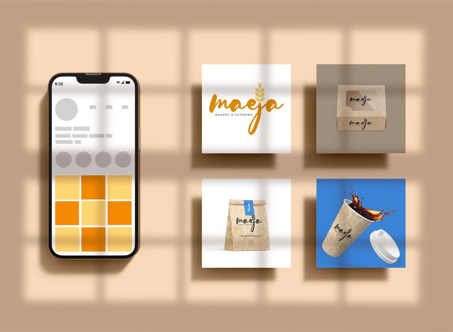
maeja bakery
"Welcome to Maeja, where every delicious creation is a testament to our passion for baking. From the moment you step through our doors, the aroma of freshly baked breads, pastries, and cakes envelops you in warmth and comfort. With a dedication to quality ingredients and artisanal techniques, we craft each treat with love and care, ensuring that every bite is a delightful experience. Whether you're craving a flaky croissant, a decadent cake for a special occasion, or simply a comforting loaf of bread, our bakery is your go-to destination for all things sweet and savory. Come indulge in the magic of our oven-kissed delights and let us elevate your everyday moments into extraordinary memories."
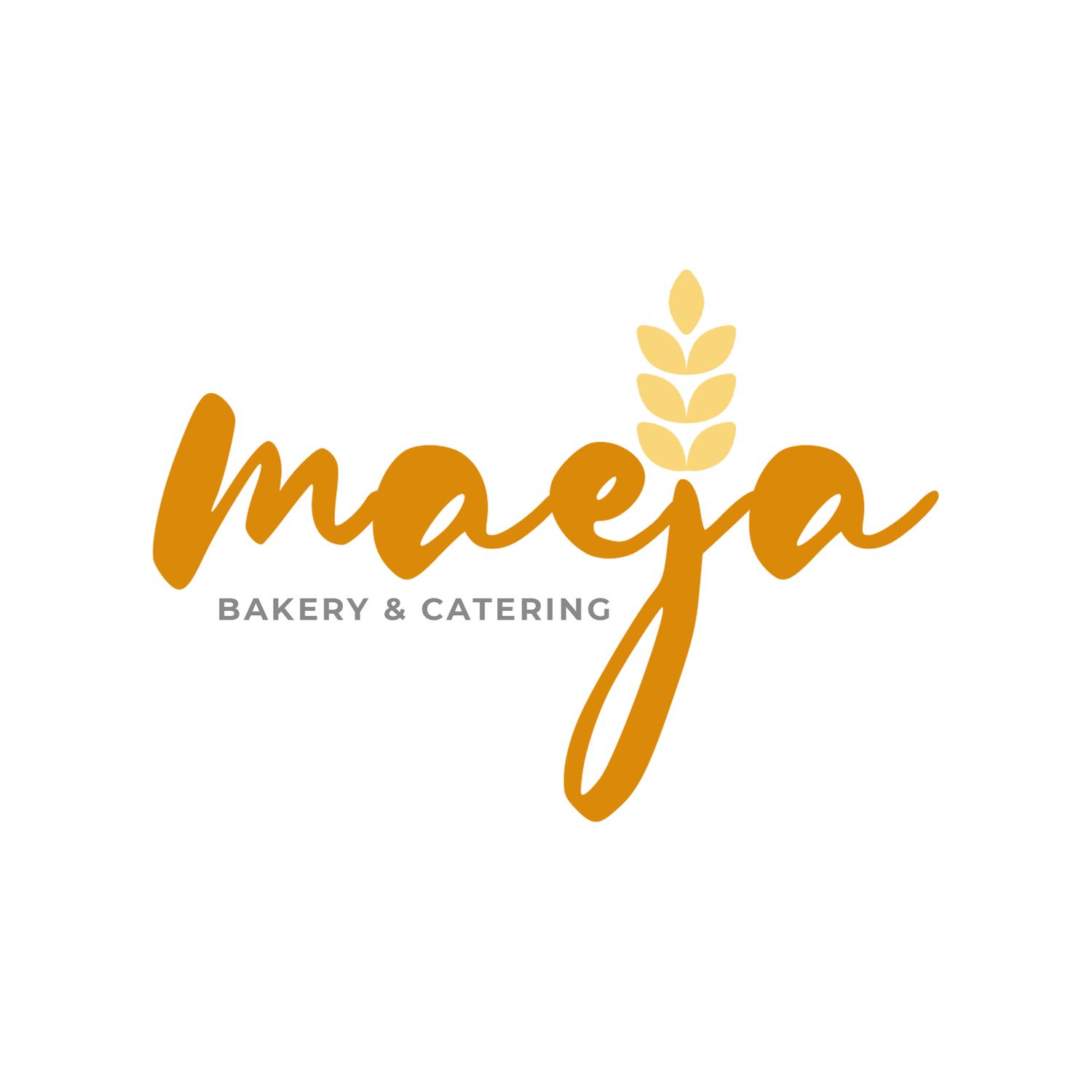
LOGOMARK

SECONDARY LOGOMARK
why this logomark?
The letters:
Represents the full name of the business, it is a stylized image with all 5 letters clearly indicated to convey a character that is classy and elegant yet, direct and to the point.
The wheat grain :
Represents the strong and firm foundation that the "maeja" is built upon. It is an elegant and somewhat regal visual message that stamps the logo image with a clear reference to the purpose of the business. It also serves
as an indicator of the fresh and industry standard ingredients used in your products.
The Text Image:
This helps to do 2 things... l. it points patrons to the owner and CEO using the letter " J", the first letter in her name, and 2. it gives a clear and direct reference to the industry standard ingredients used in creating all of this bakery's confectionary goods.
what makes this logomark useful?